Background ->
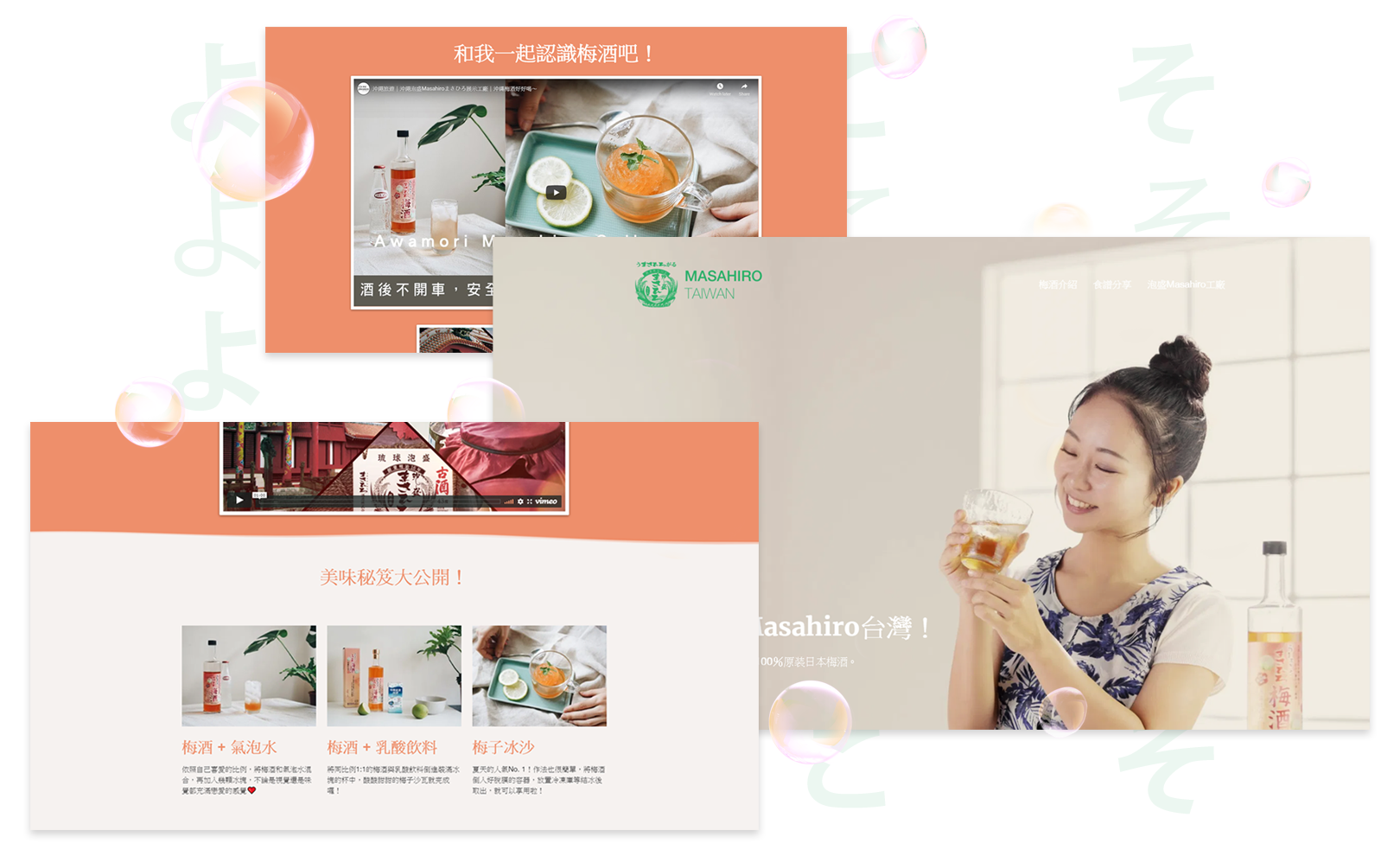
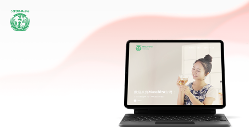
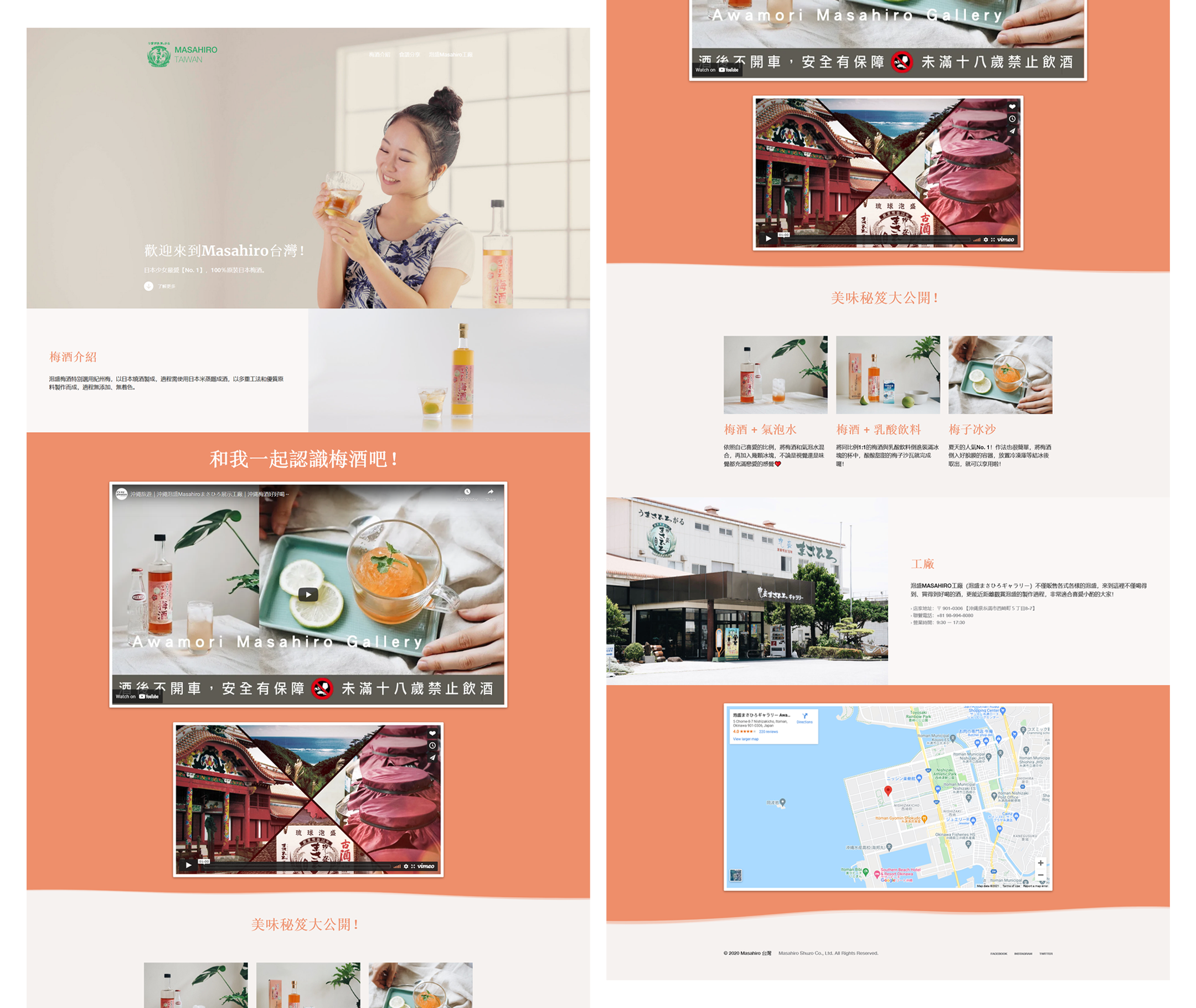
Masahiro is a sake brewery company located in Okinawa, Japan that is famous for its awamori. At the time, the company was trying to expand its business to Taiwan and was looking to build a simple responsive landing page that can convey its brand and present its products that appeal to the younger Taiwanese crowd without being overwhelming.

Design Journal
Role
Interface Designer, Layout Designer, Front-end Web Developer
Hard Question, Simple Answer
Design Question
- How would we enchant and inform potential customers from the younger crowd about Masahiro’s awamori and attract them to try it?
Surprisingly Simple Answer
- Design an aesthetically pleasing website that adds Masahiro's awamori essence to the website
Process Overview

Process overview of this landing page design project
01. Ideation
Brainstorming
Although technically from the younger crowd, unfortunately, I can’t be considered one of the user targets of this project since I was born and raised in Indonesia during my early years and spent my college days in Singapore.
This also brings an extra unique problem to this project as my design taste was greatly influenced by my time in Singapore, making me almost unfit to design something that is aimed towards the Taiwanese people – since each person’s design taste varies greatly depending on their geographic location.
Feeling stuck, I quickly arranged a few mood boards that I can use to refer to them during my brainstorming process, aside from that I also asked my Taiwanese friend for their opinions, primarily regarding colors.
Colors and Font
After a few design iterations, I settled on apricot-orange as the website's primary color to go with Masahiro's iconic green and the PingFang TC as the main font family that will complement well with the simple, aesthetically pleasing landing page that I'm going for.

The font and color scheme of the landing page
02. Wireframing and Prototyping
Blueprint
During the initial design process (wireframing), there are three main points that I focus on:
- Simple and clear layout
- Concise content with clear wording
- Attention-grabbing without being annoying
After taking into consideration of those three points, I went to draw a few sketches to get a rough idea of how the layout would look like.
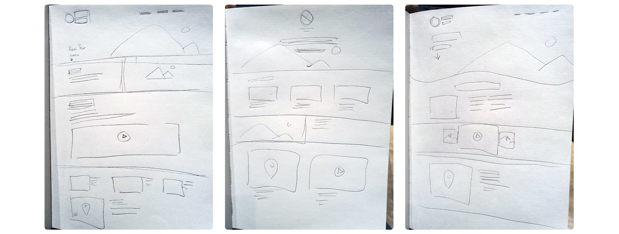
Few low fidelity wireframes of the landing page
Cleaning Up
After receiving enough feedback regarding the three initial layouts, I decided to create a new layout that combined the three layouts' strong suits and adds few layout optimizations to make it clearer and more simple.
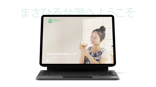
High fidelity wireframe of the landing page, notice the usage of the wave-ish effect, used to add awamori's accent to the page
Since the main objective of the design is only to inform user targets about Masahiro's awamori, there was only one CTA section, urging users to scroll down to know more about the product and the rest are all content that was provided by the client albeit tweaked a bit to fit the website layout better.
03. Development
Building the Magic
Why WordPress? During the first meeting with the client, we discussed few options (Wix, Squarespace, or build from scratch), but settled with WordPress instead, as that's what they are most comfortable with and way more time-efficient than building from scratch.
Aside from that, WordPress also allows me to import our custom theme file (CSS) without being restricting like other options that were discussed, and most important of all, the numbers of resources regarding WordPress that exist on the internet.
Another thing that I have done during this process was to make sure that every media files on the website have to be optimized, this means low image size without sacrificing too much of the image quality, video that loads fast without no buffering time.
04. Outcome
Upon few weeks after completing the project, Masahiro noticed quite an increase in their initial sales in Taiwan, although they didn't tell me how many — only that it is better than what they initially expected.